Case study
Boosting new users’ medical purchase funnel
Background
DoktorABC is a digital health platform for people who suffer from ongoing medical conditions run by Helfy, a telehealth company. One of the company’s main challenges was to crack the purchase funnel for German new users in the ED (erectile dysfunction) category, and help them to choose their treatment – a self-serve experience.
With several ineffective experimentations under their belt, Helfy hired our team to boost the funnel’s performance.
Team

Israel ben baruch
Product lead

Moshe thishinsky
Product designer

Shany Dermer
Senior product manager
Funnel analysis: recognize opportunities in the user journey
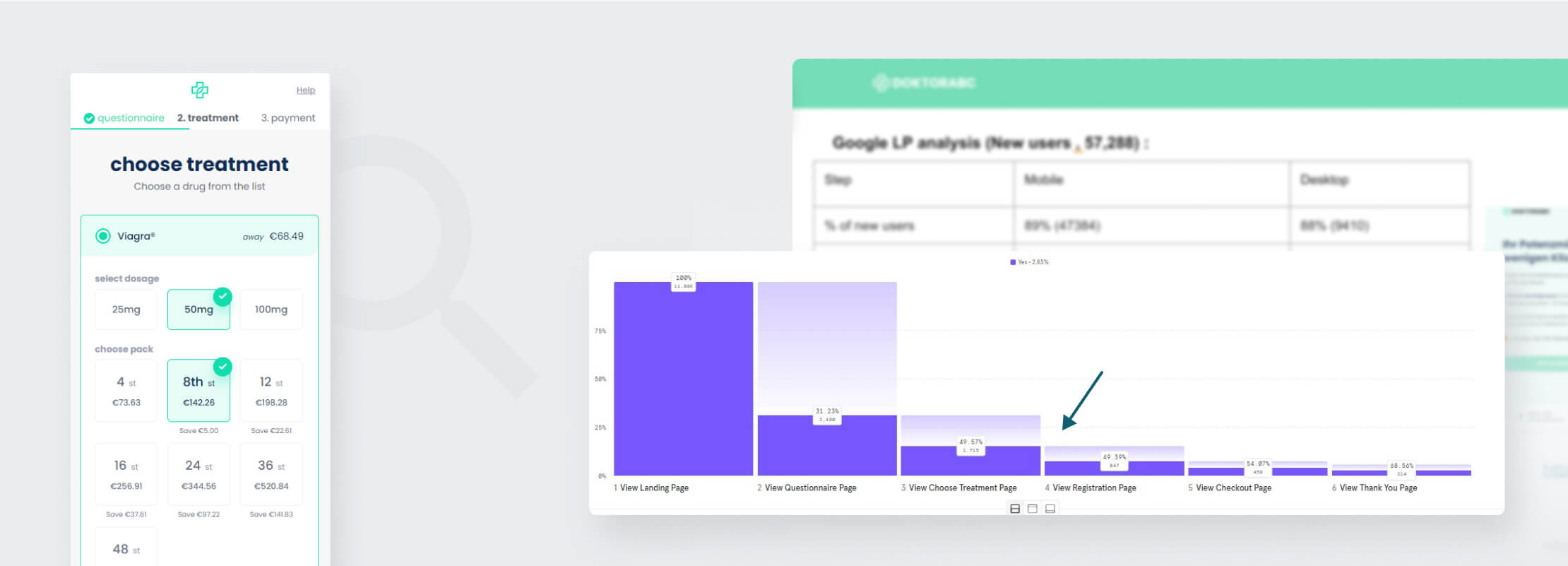
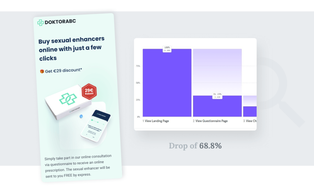
We dove deeply into the data, identifying 2 opportunities that begged seizing: 1. A drop of 69% in the landing page. Apparently, the landing page simply didn’t work for a chunky portion of the users.
2. A drop of 50% in the Choose Treatment section. Half (!) of the users – engaged users who just spent 7 minutes on 15 medical questions – abandoned the funnel at this stage.
The users: Uniqueness of culture and age
User interviews
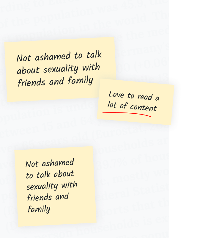
We interviewed Germans users to glean cultural tendencies relevant for the experience, and learned that –
Germans are obsessed with data privacy, are open about sex and sexuality and mostly trust German doctors.
<span data-metadata=""><span data-buffer="">Qualitative surveys
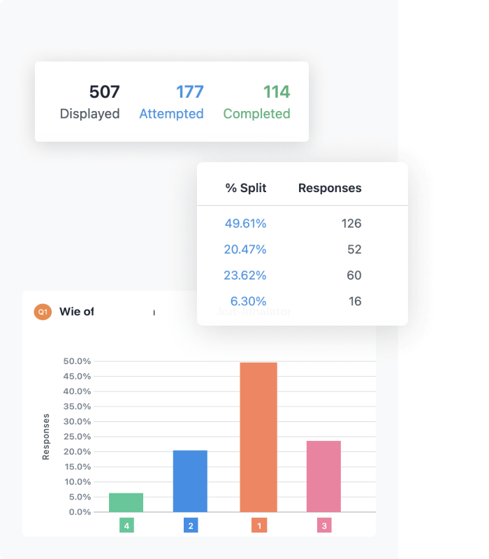
We ran post-purchase surveys for insights about motivations and needs:
70% said discretion was the most important parameter in the process. Up to that point, discretion was absent from all communication in the funnel.
User personas
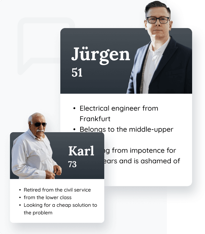
We identified the ICP (Ideal Customer Profile) age, demographics, pains and desires – to determine:
1. Traffic sources to reach the audience.
2. Relevant messaging of the service, its value and benefits.
Choose treatment: The art of decisions making
The problem
Choose treatment pitfall
3 steps and 15 medical questions in, 47% of the users abandoned the funnel.
The challenge
3 core choices
The user has to make 3 choices to select treatment: brand, dosage and quantity. Lacking context, guidance and a meticulous UX/UI, this stage was a bounce-rate bomb.
The opportunity
Engaged users
We hypothesized that clarity, trust and ease-of-use will relieve users from unnecessary hassle. A no-sweat Choose Treatment experience will land them fresh and jolly on the registration & payment page.
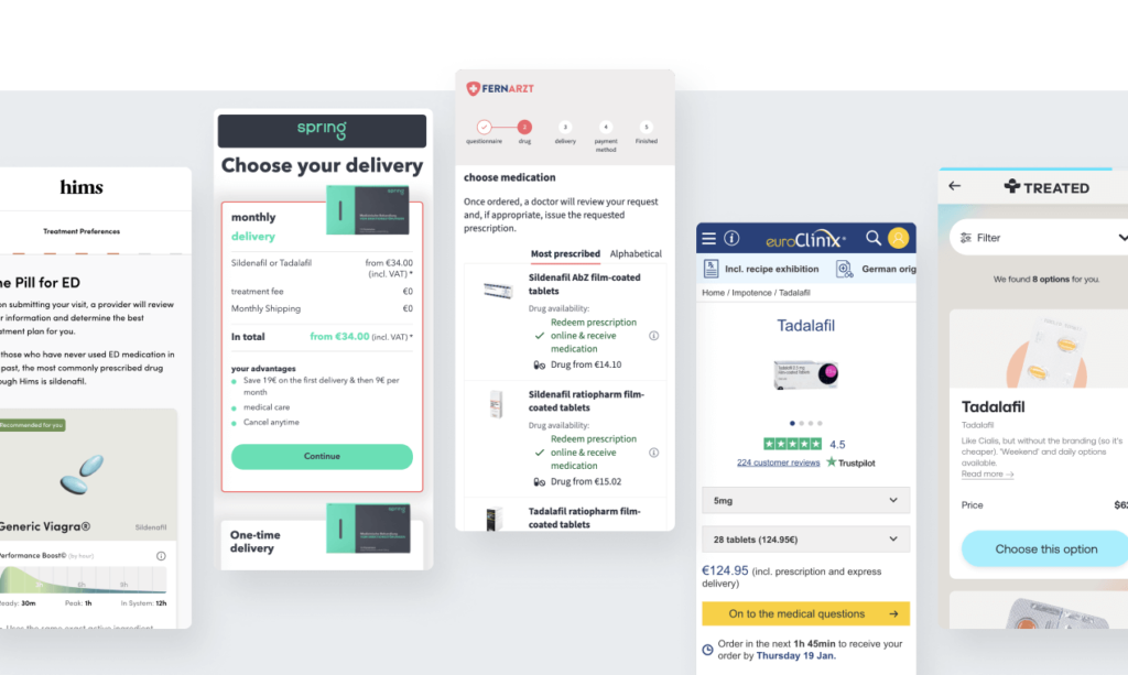
Market research: identifying the main challenges
The dense competitor landscape reveals a variety of approaches for the following key dilemmas:
- Order of options available to the user
- Stages splicing, number and sequence
- Density of information in each stage
- Trust signals choice and placement
UX concepts: From express order to personal adjusted support
Our goal was ro create a seamless decision-making process for the core choices (brand, dosage and quantity).
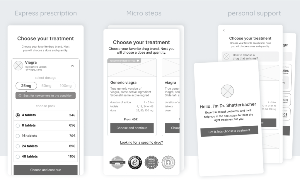
We ended up with 3 concepts, based on 3 hypotheses
Express prescription: 1 screen, 3 choices
Micro steps: splice options into small, simple decisions
Personal support: medical guidance at every stage
Usability testing: Users’ needs led to a new surprising concept
We learned that users’ patterns and needs differ based on one question: do the users know what medicine they need.
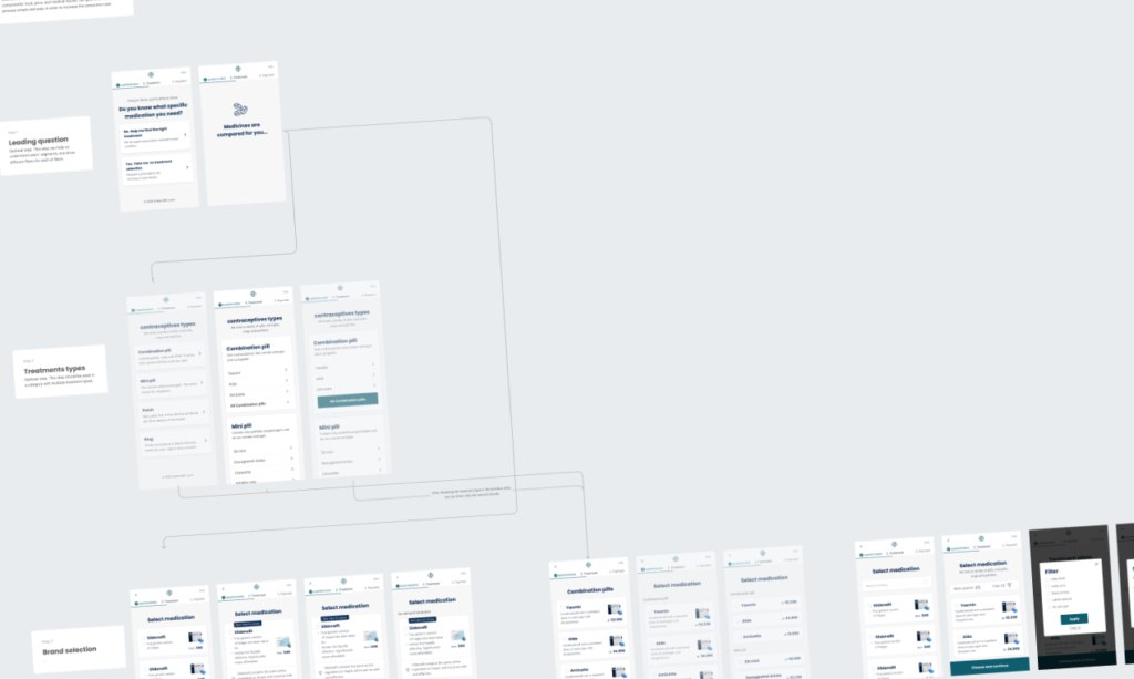
Thus, the “Leading Question” concept was conceived: The funnel is initiated with a question: do you know what you need or do you need advice? The funnel is then tailored based on the answer to a lean or a detailed experience.

User flows: adjusting the funnel to 7 medical categories
Once our concept was defined, we adjusted the user flows according to the various use cases:
1. Adapt flows to the specific requirements in 7 different medical conditions. For example, unlike ED treatment, Asthma medication doesn’t require dosage selection.
2. Fit flows to on-demand medication vs. daily medication. For example, Asthma inhaler vs. birth control pills – each required a different experience
UI: Focus on clear and simple design
Redesigning the original experience, we aimed for a user-friendly, clear and consistent UX and UI, catering to an audience that includes non-savvy digital users. When recreating the layout, We paid special attention to –
1. A solid hierarchy within text elements and visual components.
2. Color pallet and consistency – easy on the eye and friction free.
3. Simplicity in the selectors elements
Crafting a specific experience within a larger system created a challenge: We tried to create the balance between a good user experience to consistency with the existing sub-optimal design system of the platfor.

Landing page: Data-driven Experience
Funnel analysis:
High Intent. Low CTR
The users were mostly new to the platform. Most of them were also new to the medical condition.
Landing on the page through high intent traffic search on Google indicates they had some warm-up, and would be willing to proceed to the exploration and purchase funnel.
And yet we immediately identified a big drop at the top of the funnel. Despite a series of optimization moves the team had run before, something wasn’t working.
Page analysis: The missing CTA
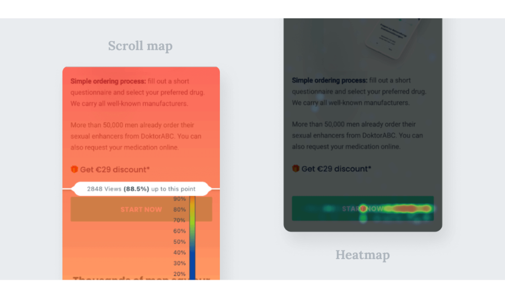
We analyzed the page heat maps, scroll maps and session recordings.
One thing that popped out was that 12% of the users didn’t even see the main CTA to start the medical questionnaire that was located below the first scroll.
Market research: One product, different messages
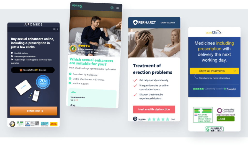
While the competitors’ approach is diverse in length and messaging, all of them ingrate trust signals and value-for-money triggers in their landing pages.
We highlighted several dilemmas:
- Messaging and tone: should the copy focus on the opportunity, the pain, or the price?
- Messaging hierarchy
- What trust signals to surface, where and how
- Optimal messaging scope – should we explain the medical condition or keep it short and focused
Concepts: Simple online process vs. living the dream
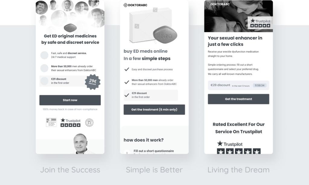
Brainstorming concepts, we diverged and converged to the following 3 concepts:
- Simple is Better Focus on online solution simplicity
- Living the Dream Zeroing in on the user’s desired outcome from the medicine
- Join the Success Emphasis on social proof – number of satisfied customers and user reviews
Design: Information hierarchy and meticulous UI
The simplicity concept was the one we chose to start with.
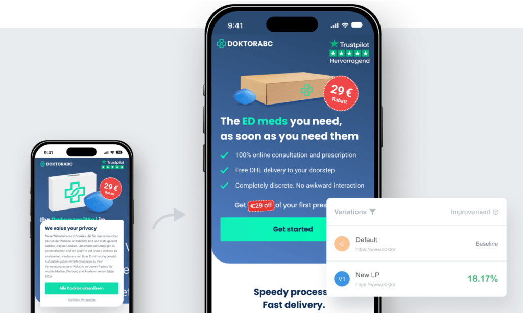
I created a design with a focus on information hierarchy and meticulous UI, while using the main elements to induce a decision: an image that tells a story, trust builders and prominent discount.

Test iterations: From long and detailed to short and discreet
Our testing journey was quite a roller coaster: We started with a long landing page consisting of 7 sections.
4 iterations later we ended up with 3 sections long page, a new main image implying discretion and privacy and small tweaks – which took us to the finish line with a 15% uplift in CR. What a ride.
Behind the scenes of the process
Extensive and challenging, this project taught me some valuable insights.
Here’s a glimpse into my Figma workflow, which showcases my use of styles, simple and complex components, design systems, and more. I hope my passion for Figma is evident in the file.

